Hacker Newsnew | past | comments | ask | show | jobs | submitlogin

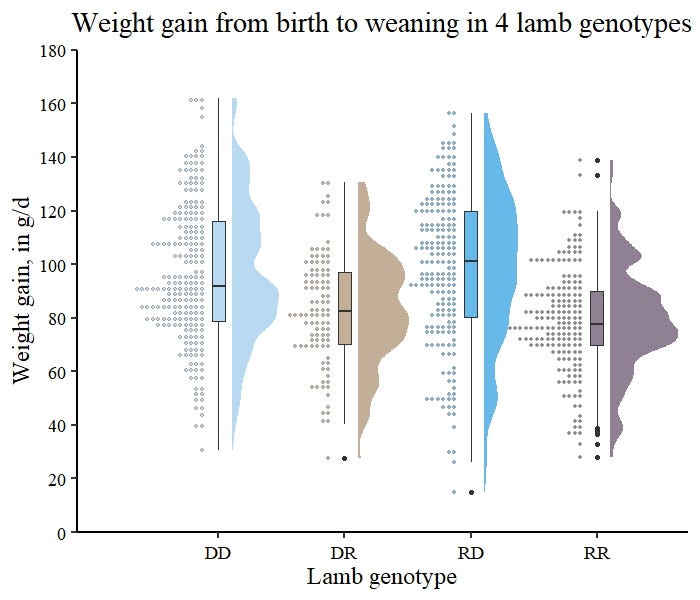
I'll take a plain histogram/kde plot every day of the week over those damn violin plots. I think box plots are quite usefull as they are easy to read but only if you trust the author has actually looked at the histogram. And you can typically not trust the author to have done that.


Perhaps you'd find the half-violin plot more readable? Seems there's a whole world of all-in-one "raincloud plots" that integrates them, like the lower infographic here: https://raw.githubusercontent.com/Z3tt/TidyTuesday/main/plot...

You can even make 'em show histograms: https://miro.medium.com/v2/1*J3Q4JKXa9WwJHtNaXRu-kQ.jpeg


For the latter, it looks like the histogram is probably sufficient. The violin plot just adds extra visual noise.


Violin plots essentially are KDE plots, but you can put multiple of them on the same axes to compare groups.


A violin plot is literally just a KDE sideways.


It also has a box plot tacked on because "why not"?


Sometimes it’s useful if the mean/median has meaning


Guidelines | FAQ | Lists | API | Security | Legal | Apply to YC | Contact

Search: